
THE ART OF A BOOK COVER
Last month, here at Silver Petticoat, we chatted about the cover design process of Richelle Mead’s Glittering Court with its designer, Lindsey Andrews. In that article, I also personally shared some of my favorite “typography” cover designs since Lindsey was also the genius behind the redesigns of Stephanie Perkins’ Anna and the French Kiss, which in my opinion owes a lot to its typeface. Today, we’re interviewing Red Queen‘s cover designer, Sarah Kaufman, but not before I talk a bit about some of my favorite examples of covers all about a logo or prominent “object.”
Part of a good story is the “wrapping.” Though reading a novel’s synopsis will ultimately decide whether or not a reader is interested in a novel, its design is what first catches the eye. As with everything, the art of cover design has evolved over the last decade. From cool and shiny to simple and sharp typography, bookshelves are filled with pretty jewels of paper.
RELATED | The Art of Book Cover Design, Part 1: An Interview with Glittering Court’s Book Designer, Lindsey Andrews
One of the more groundbreaking scenes in the process of cover design is the YA genre. Within that, a popular use of concept and design is a single symbolic imagery that is significant to the world of the story within its pages. Since the publication and marketing of The Hunger Games, the use of a logotype of design has become a simple and effective way of conveying a story.
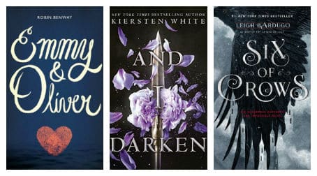
Some of my favorite uses of this use of design include the new release of C.J. Redwine’s The Shadow Queen (ironically, Sarah also designed this cover!) and Robin Benway’s Emmy & Oliver. In the case of the later, Emmy & Oliver could also be praised as more of a “typography” image, but I don’t think the fingerprint heart sitting beneath it should be discounted as insignificant. The fierce cover design for Kiersten White’s upcoming And I Darken is all about an object with its saber, and is then softened with its elegant purple flowers. On Leigh Bardugo’s “Six of Crows” series, the first book, Six of Crows, also prominently features a majestic crow interlacing with a cityscape proving its more about a symbol within the story than using a model to convey a message. None of these are novels I’ve read, but if their summaries are an indication, they suit the stories well.
Sarah Kaufman Interview
Today, in “part 2” of our cover design series, we’re chatting with another designer. Our interview is with Sarah Kaufman, the designer behind Victoria Aveyard’s logo-centric Red Queen novels. The sharp and elegant covers of this romantic dystopian series are as edgy as they are beautiful. Below, Sarah Kaufman shares some behind the scenes facts about the process of this popular YA series. (PS: it’s a super cool process!)
Welcome to The Silver Petticoat Review, Sarah. We appreciate you taking the time to share some behind-the-scenes knowledge of the cover design process.
Q: What does a normal book design process/project look like for you? (I.E. How much do you know about the novel when you begin designing?)
Sarah Kaufman: Oh man, so much goes into the design process, and it’s quite the team effort. But first, I get a summary from the editor. This is usually a page or two of basic information: plot points, character descriptions, and a note from the author explaining what they would like to see on the cover. We also have a think-tank of sorts to refer to—books that have done well in their respected genres. I usually keep those books in mind when I first start to think about designing a new books or series.
I also get a manuscript. This can be really tricky though since I work a year from when the book hits the shelves. Most times the manuscript is incomplete. In some cases, the ending or big plot points completely shift so I really don’t want to rely too heavily on the narrative. Instead, I read each book to get a mood and feel of the story. This is super important for first-time authors or authors I’m unfamiliar with.
After reading and speaking to the editor I’ll sketch out ideas. I’ll always include what the author has described, and that usually takes me to a whole new visual space. After I am comfortable with a few rough ideas, I will bounce it off my Art Director, Creative Director and the Editor. We can go back and forth a bit on these compositions before we share with larger teams of people.
Finally, we contact an artist (photographers, illustrators, hand letterers, collage artists, etc.) who deliver a better representation of the composition. This last step is my favorite. Most times artists take an idea we have collaborated on and really run with it. It’s amazing to see a rough draft take shape into a final product!
Q: Where do you glean inspiration for a new project?
Reading the book helps a lot! Also, Pinterest is a life saver, it’s so nice to save that something you’re not sure what to do with for later. Most of my creative flow comes from researching artists’ work, photographs, and illustrators. I’m also really lucky to work on a team of extremely visual people. We can look at artist samples and go “that would be great for this book!” or “this person’s sketch reminds me of …” It’s amazing how much talent is out there.
Q: On average, how many revisions does a cover go through? And can you give us any examples of revisions a popular novel has undergone?
Usually, I’ll present 5 solid compositions in a rough state. From those 5, one or two will be executed further. Sometimes that will mean tighter sketches with artists, sometimes it means doing a photo shoot. After we have received the art, we again present renditions of that art with different designs (maybe different kinds of type, color, or overall art placement.)
Usually, I’ll present 5 solid compositions in a rough state. From those 5, one or two will be executed further. Sometimes that will mean tighter sketches with artists, sometimes it means doing a photo shoot. After we have received the art, we again present renditions of that art with different designs (maybe different kinds of type, color, or overall art placement.)
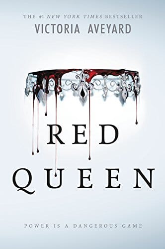
For example, with Red Queen (which was a HUGE book for us!) we had maybe 10 initial ideas. Of those 10, we decided on an inverted crown dripping blood. We had an amazing photo shoot with photographer Michael Frost where he must have taken hundreds of shots. We edited the shots down and designed 9 compositions of inverted crowns. From those 9 comps, we slowly chipped away, redesigning the type, rearranging the length of the blood drops, and trying variations of the background color. I’m not exactly sure how many total comps were done for Red Queen, at one point I know I had about 40—but we finally, finally got it perfect with the one we have now.
Q: Just for fun: One of my favorite cover designs of yours is, of course, Red Queen, but as a designer, which cover(s) has been among your favorite to work on/design, and why? Inquiring minds would like to know!
Well, thank you so much! It has been so fun working on the Red Queen series. It’s such a great world to have a small role in—I’m really very thankful to be a part of it!

I’ve been really lucky to work on a lot of awesome projects. Most recently a favorite is The Shadow Queen by CJ Redwine. We had the idea to carve the title of the book out of a poisoned apple. Artist Sean Freeman really went the extra mile on that concept. Most people think the apple is digital, but it’s totally real! How cool is that?
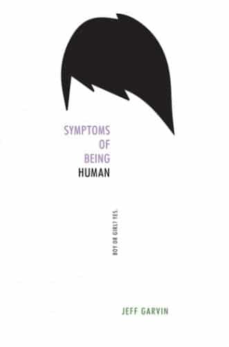
Another cover that is so close to my heart is Symptoms of Being Human by Jeff Garvin. The main character in the book, Riley, has an anonymous blog where David Bowie is the avatar. I freaking LOVE David Bowie. I got to design the cover for Symptoms based on one of my all time favorite musicians. If anyone would have told me that was a viable career option when I was a teenager, I’d never have believed it. It’s a sort of a dream come true to not only design a cover for a book that is super important, but to be able to use influences you’ve carried around most of your life. It was a really nice bridge to construct.
Two of the more popular general designs seem to be cover models (used various ways in everything from a cute couple cover to a more evocative image) and typography. While I am always a fan of the former (because the books I read often have the fortunate case to be cute or exactly what the story needs, I am going to love the typography so many designs seem to sport.
Thanks so much for taking the time to join us on Silver Petticoat today, Sarah! What a fascinating process the “art” of creating a book cover is. I find it particularly interesting to read about the specifics of how the concept for Red Queen came to be.
See more of Sarah Kaufman’s work by visiting her website or follow her on Twitter! The beautiful, Red Queen is available to order as is The Shadow Queen.
What is one of your favorite “logo” designed books? Let us know what you think of Sarah Kaufman’s book cover designs! I’d love to chat about them with you.
ARE YOU A ROMANCE FAN? FOLLOW THE SILVER PETTICOAT REVIEW:
Great post and some awesome book covers
Hi, Suz! Thanks so much for reading; I always love discovering new book covers, especially when they’re as intricate and stunning as “Red Queen.” 🙂